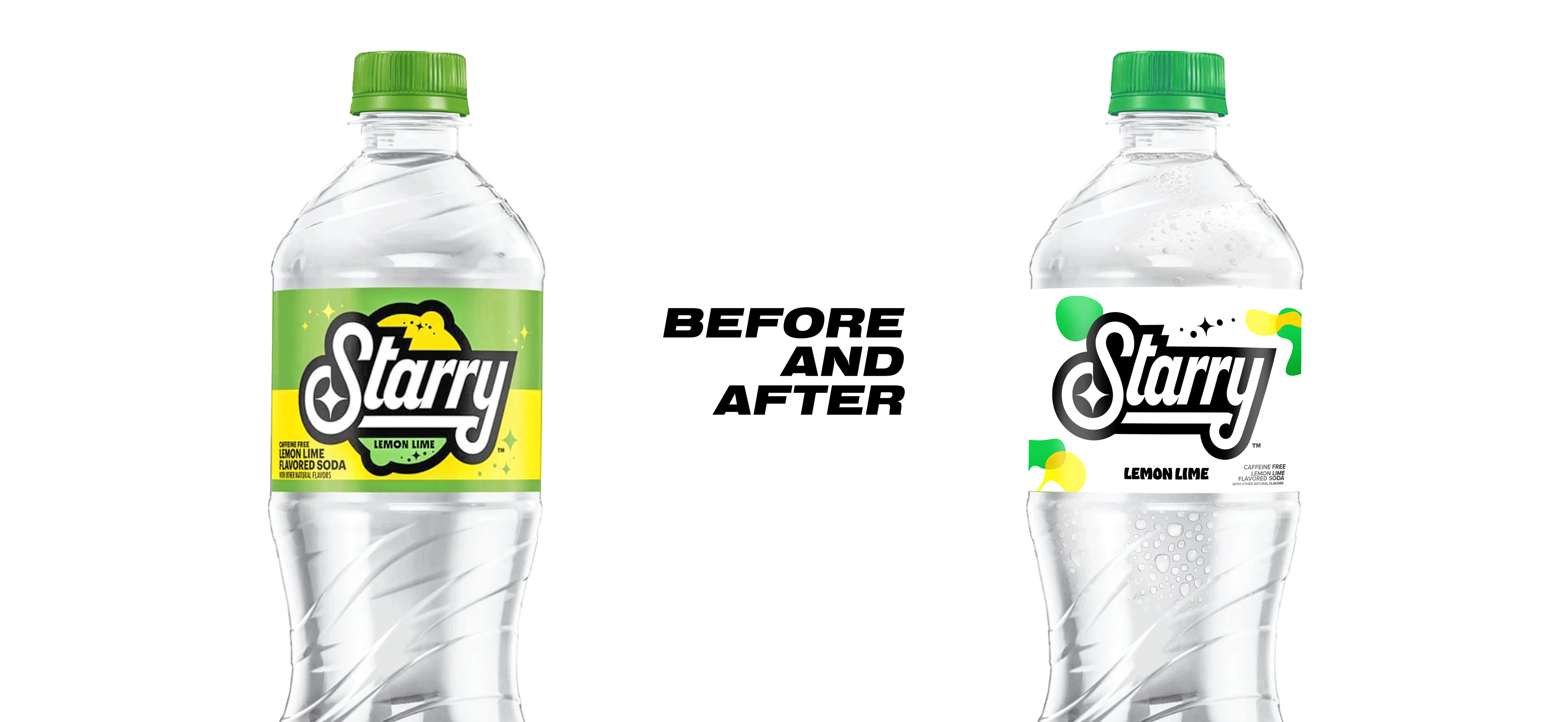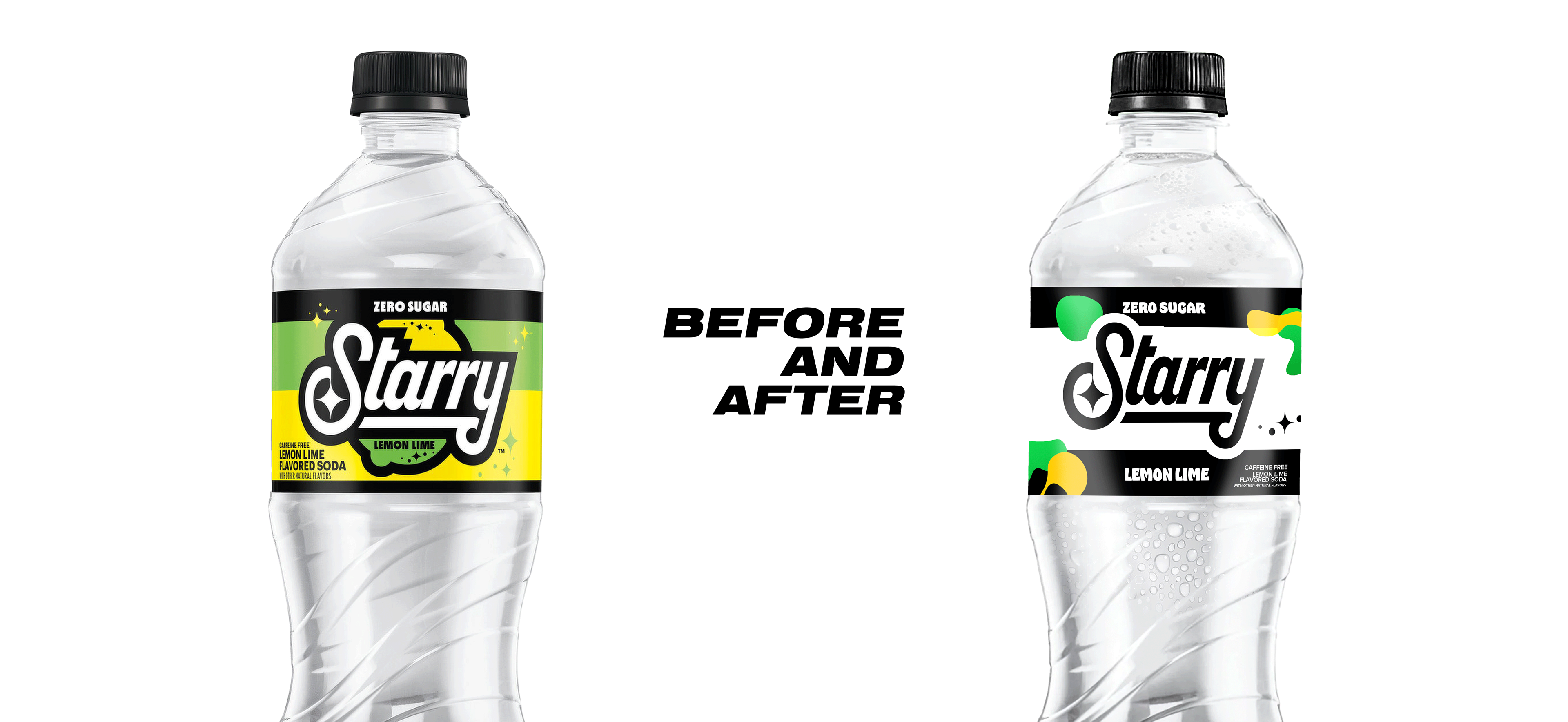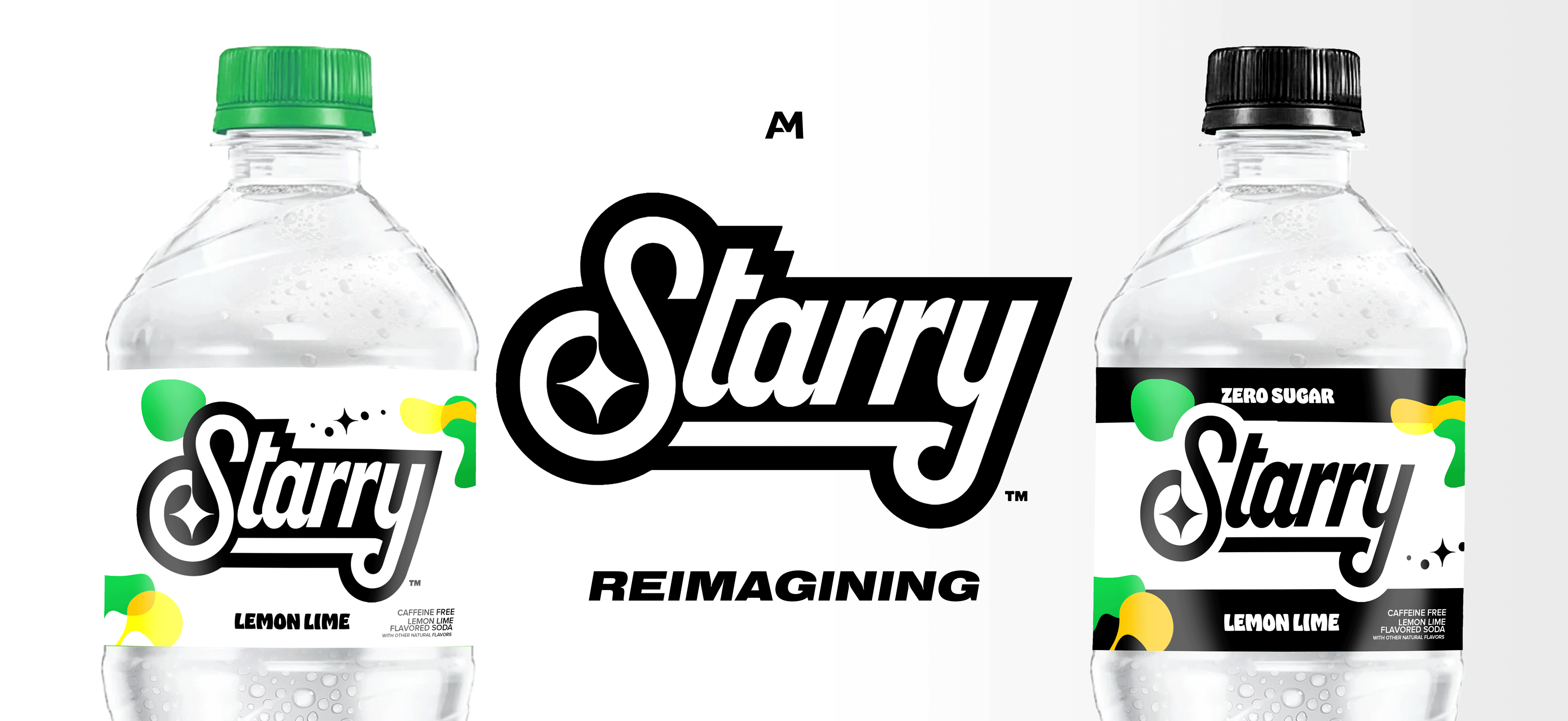

One of the biggest challenges with updating a product like this is keeping it distinct as its own brand and not looking like a competitor (mainly Sprite).
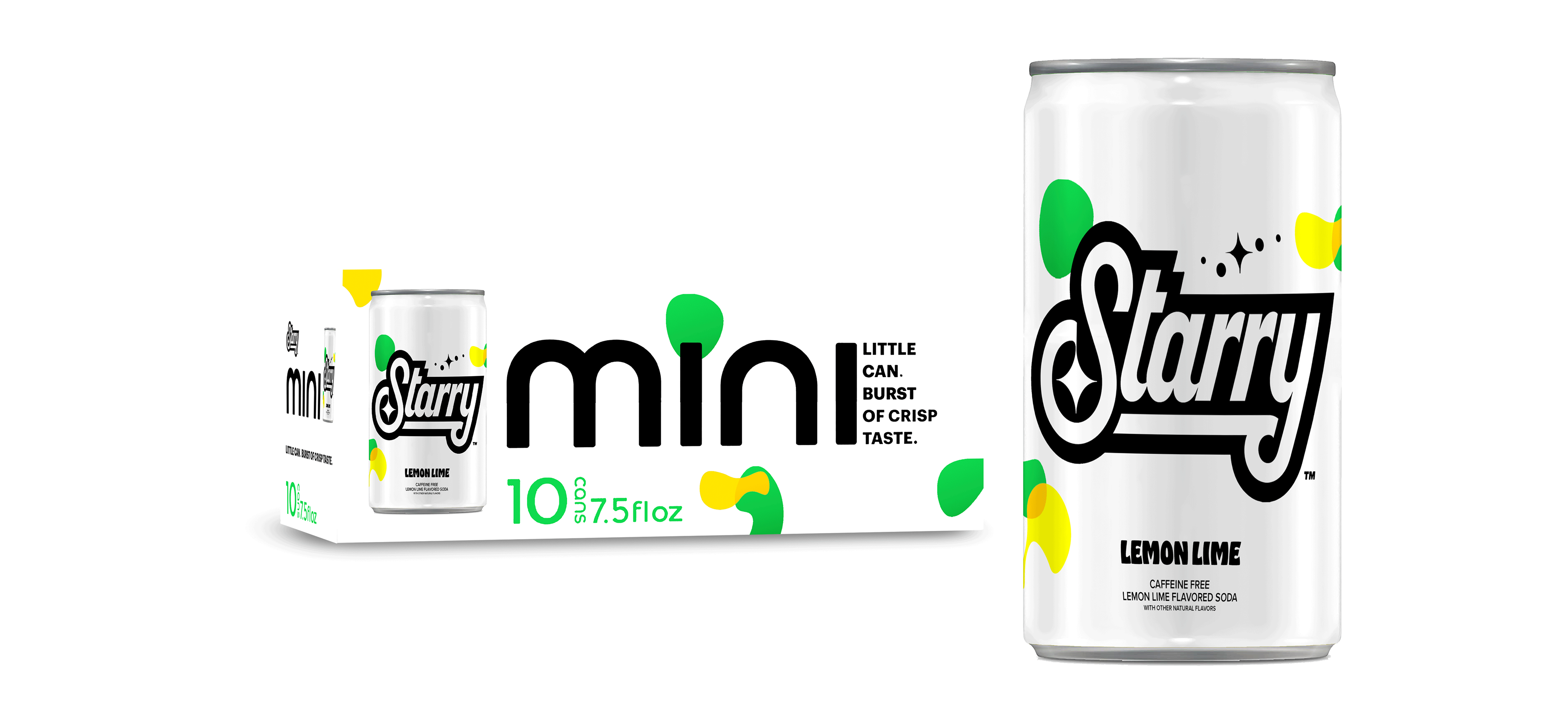
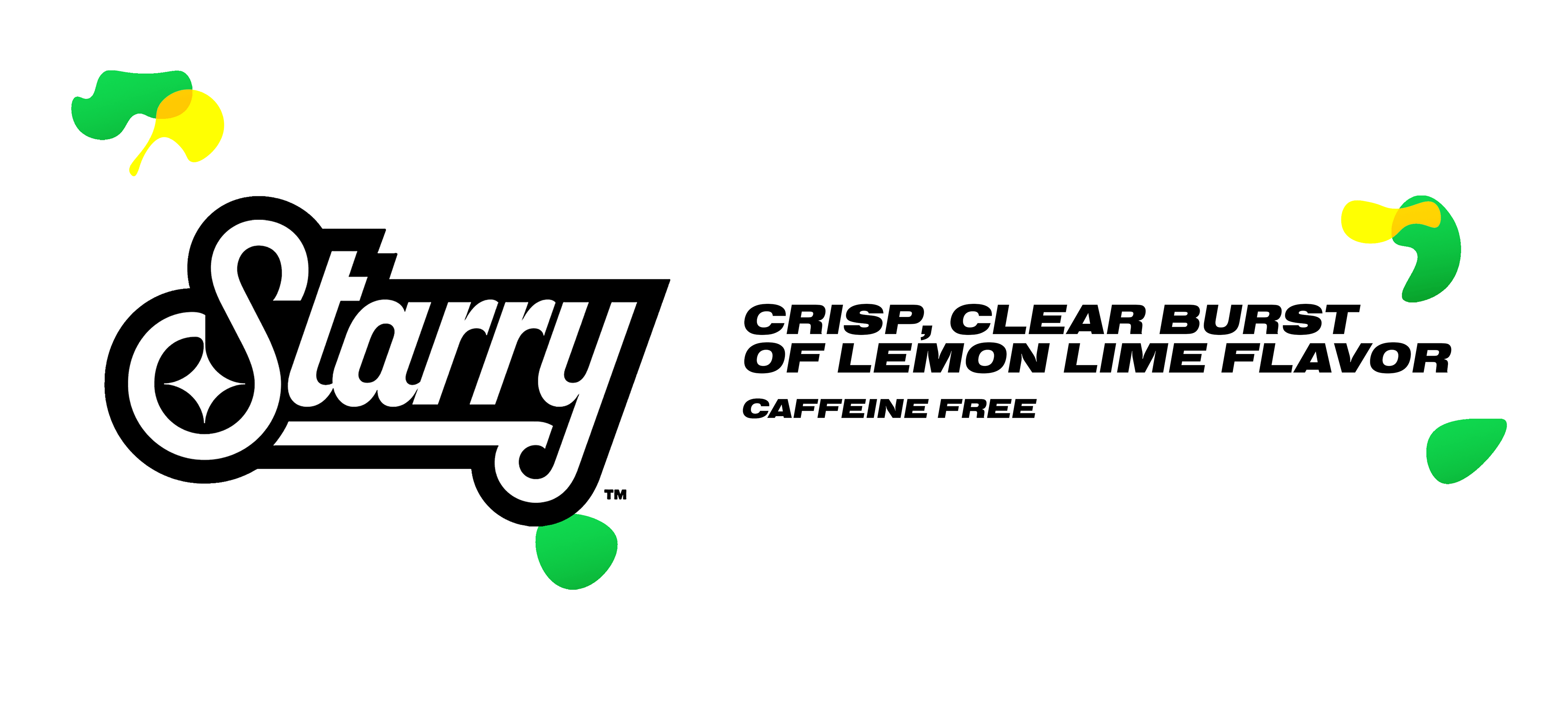
Some of the updates I would make to Starry in this project is adjusting the color scheme to be more vibrant. By making the primary label white instead of a green-yellow mix, it lets the colors pop against the label more as well as highlight the simplicity of the drink. Subsequently, I also updated the hue and saturation on the green so it isn't as dull.
I also new elements and shapes around the label to make Starry feel more playful and bubbly, more than the sparkles on the original packaging.